I thought it might be interesting to explain a little about my process when designing a logo, using an example of one I recently completed for Vital Signs & Graphics.
Step 1 – talk to the client
This is a client who came to me through an ad I run on Gumtree. His name is Paul Maziakowski and he’s a nice bloke (and if you’d like to use his services, call him on 0422 619 814). I used him to do some business signage for another client before I started work on his logo so I met him, was able to witness him doing his job and we got to chat about his logo in person. This is ideal, sometimes I only communicate with clients through emails or on the phone, often they aren’t even in Australia so there’s no option to meet in person.
Paul specifically requested type only, no symbol, and blue.
I think I’m a pretty good judge of people and that’s something that helps a lot in trying to imagine what sort of look might appeal to them. Having dealt with signwriters over the years, I also had a few notions of my own about the profession. For instance, I know that they have been around forever as a trade and, despite the digital modernisation of their job, there’s a positive association with their history. So I decided to go in with something clean and modern to suit the person, as well as a few more retro concepts to suit the industry.
Step 2 – pick some fonts
Over the years I’ve accumulated a LOT of fonts, 6567 of them in fact. I love type. My design origins were rooted in typography and so, for me, everything else stems from that.
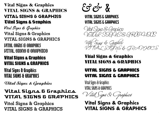
The first thing I do is type the company name into my font application and scroll through all 6567 fonts, picking out the ones that work. It’s hard to explain how a font ‘works’ with a defined set of words, it’s not just a matter of me choosing fonts I like. Some fonts just look right for certain words and concepts. Ideas come to me as I go and after an hour or so I have a page like this:

Step 3 – Google Images
Not to steal ideas but it’s important to see what the client’s competitors are doing. It’s good to see how the more professional companies present themselves and also what horrors other designers have inflicted on the weak and uninformed. Sometimes this inspires me to go back to step 2 again with a new idea in mind, sometimes it’s just good for a giggle and to make me feel better about myself as a designer. I don’t do this before I search for fonts because I don’t want to cloud my own ideas before I even start.
Step 4 – do the first thing I thought of

I look through my page of chosen ones and find the perfect font for what I have in mind. It might take me an hour or two, sometimes more, to achieve a result that pleases me. I may leave it, come back later after rendering the second concept, then maybe again after the third or fourth. Or I might get it spot on first time, like this one.
Step 5 – do more
Throughout the process I’ll have had several ideas and quite specific concepts I want to try out, so I do. Some are more slyle based, others process based. For instance, in the image below of the next 3 logos I came up with, the first was “something to do with billboards, big, solid, strong.” Plus I really like a 3D logo and sometimes clients agree with me so why not? The second was based on something I saw in my image search. The idea of cutting type in half, although what I’d seen was very different, had appealed to me. The third was completely to do with my respect for the longevity of the signwriting trade. I had a picture in my mind of an old signwriting business that’d been around since the 70’s and was trading on the old “Est 1974” concept that used to be so popular in logos. I wasn’t sure the client would get it but I thought it was a good idea so again, why not?

Step 6 – send them on
So now I package them up into a PDF, make sure I specifically mention that there are multiple versions on multiple pages (you have NO idea how often people don’t realise there’s more than one page) and hope for the best.
Pre-email technology, I would meet with clients and present the designs and discuss them. I would naturally try to convince them of the merit of an idea they might not have appreciated or understood at first glance. I never felt comfortable doing that though, I think if they don’t “get it” themselves then the idea probably isn’t as good or as clear as I thought. And if they don’t get it, their market probably won’t either. I’m happier with the new post-email arrangement, where they get to see the options without me influencing their decision.
In over 30 years of doing this I can only remember 2 times when the client hasn’t liked anything. In my career, 90% picked the first thing I did, 7% picked one of the others, 2% went back and forth unable to make any sort of decision and 1% was deliberately wasting my time, and theirs.
That’s my process. I’m sure other designers may have quite different ones. I’d be interested to hear from you in the comments if you have any thoughts to add.

